BRANDING
AbiHo
November 18, 2025

Project Overview
AbiHo is a Bangladesh-based export garment business connecting locally produced apparel with international markets. The identity was developed to give the brand a clear, confident presence—one that feels contemporary, reliable, and ready to operate beyond the local market.
Project Overview
AbiHo is a Bangladesh-based export garment business connecting locally produced apparel with international markets. The identity was developed to give the brand a clear, confident presence—one that feels contemporary, reliable, and ready to operate beyond the local market.
Project Overview
AbiHo is a Bangladesh-based export garment business connecting locally produced apparel with international markets. The identity was developed to give the brand a clear, confident presence—one that feels contemporary, reliable, and ready to operate beyond the local market.
The Challenge
As an export-focused business, AbiHo needed to communicate professionalism before a conversation even began. The brand required an identity that could feel credible to international buyers while remaining connected to its Bangladeshi roots.
The goal was to create something simple and recognizable—not overly decorative, but distinctive enough to work across digital, packaging, and business applications.
The Challenge
As an export-focused business, AbiHo needed to communicate professionalism before a conversation even began. The brand required an identity that could feel credible to international buyers while remaining connected to its Bangladeshi roots.
The goal was to create something simple and recognizable—not overly decorative, but distinctive enough to work across digital, packaging, and business applications.
Logo construction
Logo construction

The Solution
The identity balances boldness with simplicity. A strong black wordmark establishes trust and clarity, while the orange symbol introduces energy and recognition.
The result is a flexible identity designed to feel equally comfortable on a garment package, social media post, business document, or international-facing brand communication.
The Solution
The identity balances boldness with simplicity. A strong black wordmark establishes trust and clarity, while the orange symbol introduces energy and recognition.
The result is a flexible identity designed to feel equally comfortable on a garment package, social media post, business document, or international-facing brand communication.
color palette
color palette

TypoGraphy
TypoGraphy

Logo Variations
Logo Variations

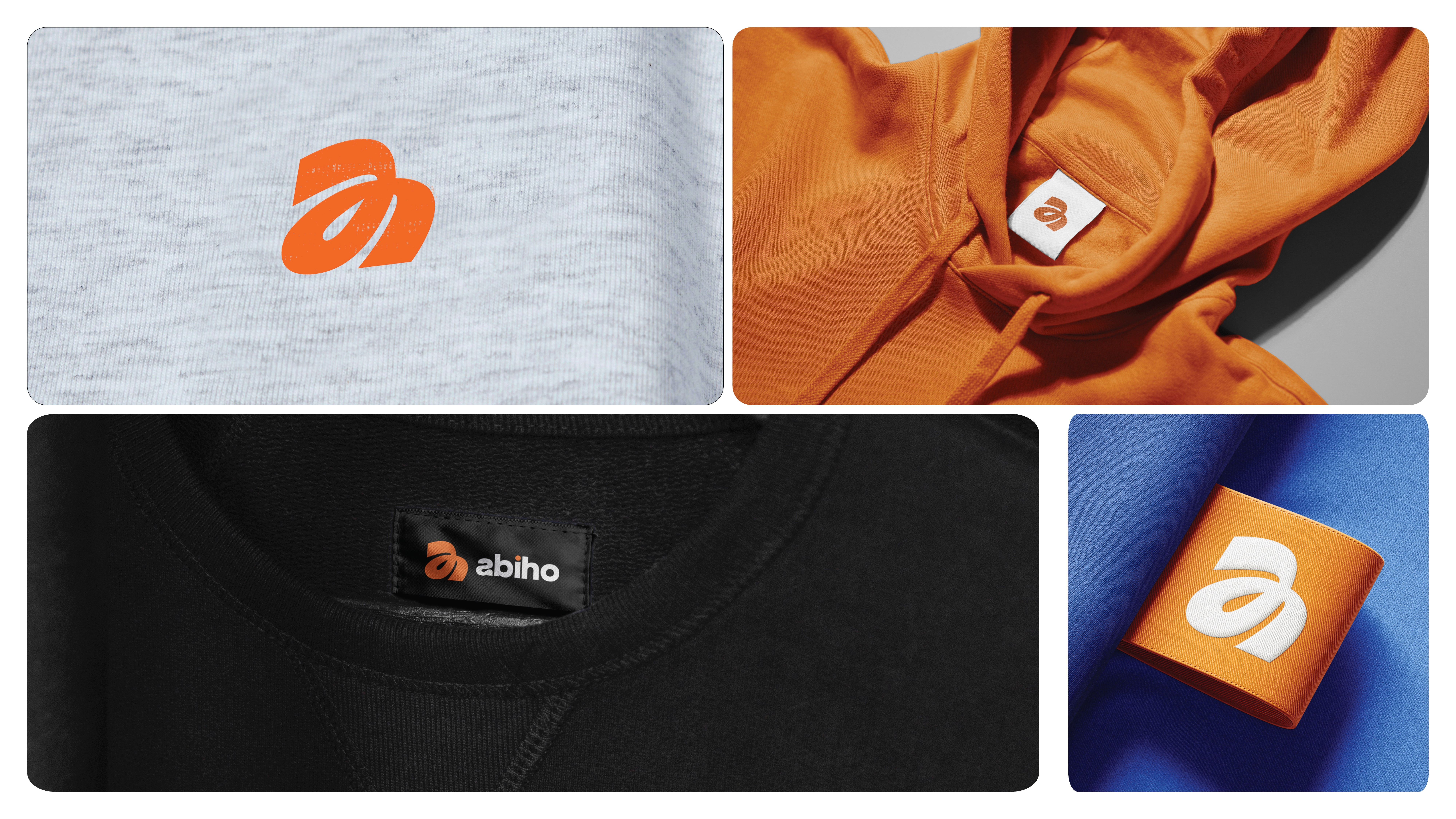
Mockups
Mockups


Deliverables
Logo Design
Brand Guidelines
Social Media Assets
Packaging Design


